Thousand Apologies
Hot Sauce for Cool People
What they needed
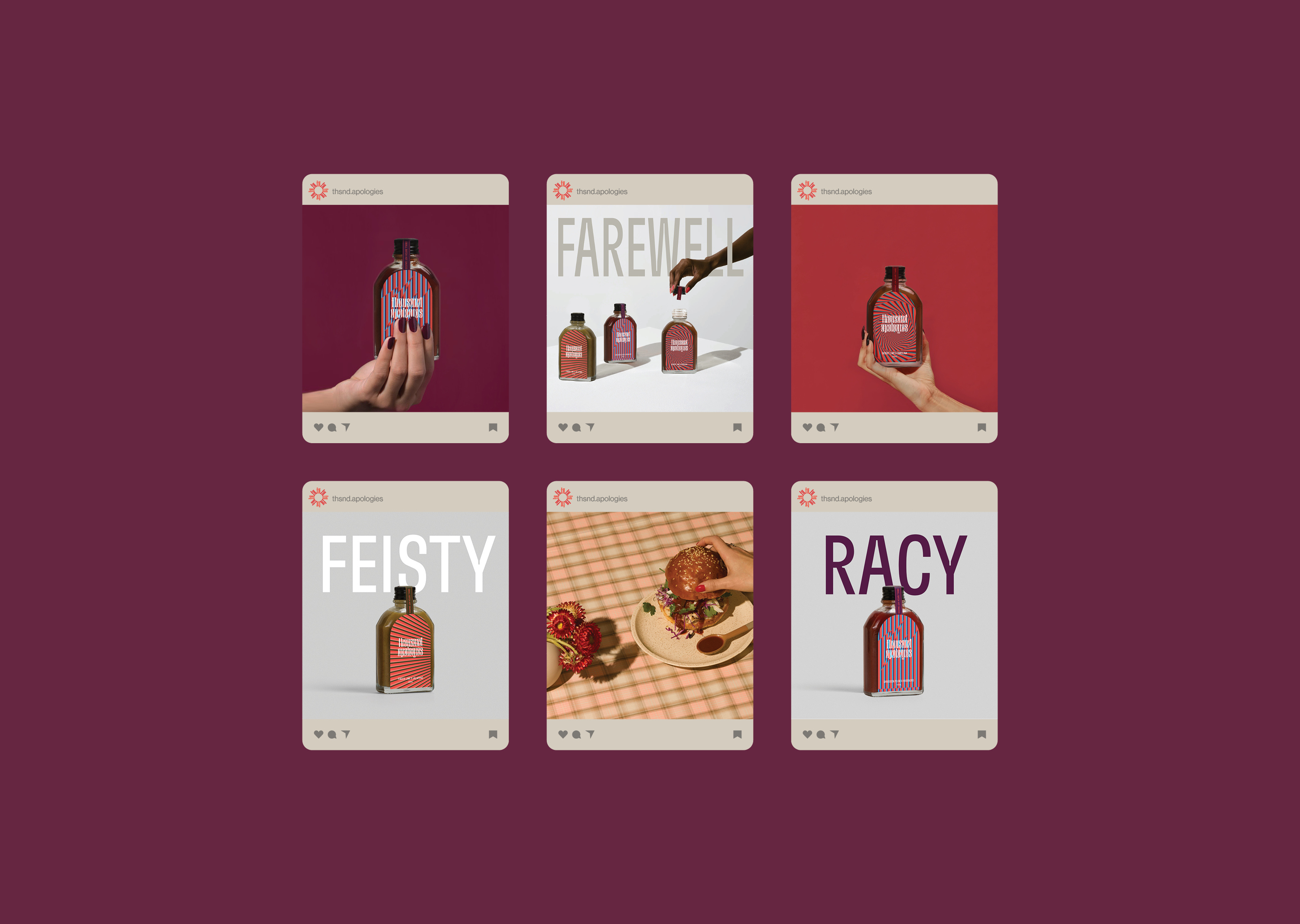
Thousand Apologies is the new underdog of hot sauces. Our brand audit and strategy process identified the elements of other hot sauce brands and the cues they often follow, devils, skulls, bums and death references. Thousand Apologies not only creates a formidable sauce but elevates itself through distinct flavour, brand, story, ingredients, sustainability and a giving back philosophy. Every element of the brand (through strategy) is considered from inception, to production to brand, tone of voice and story.
What we did
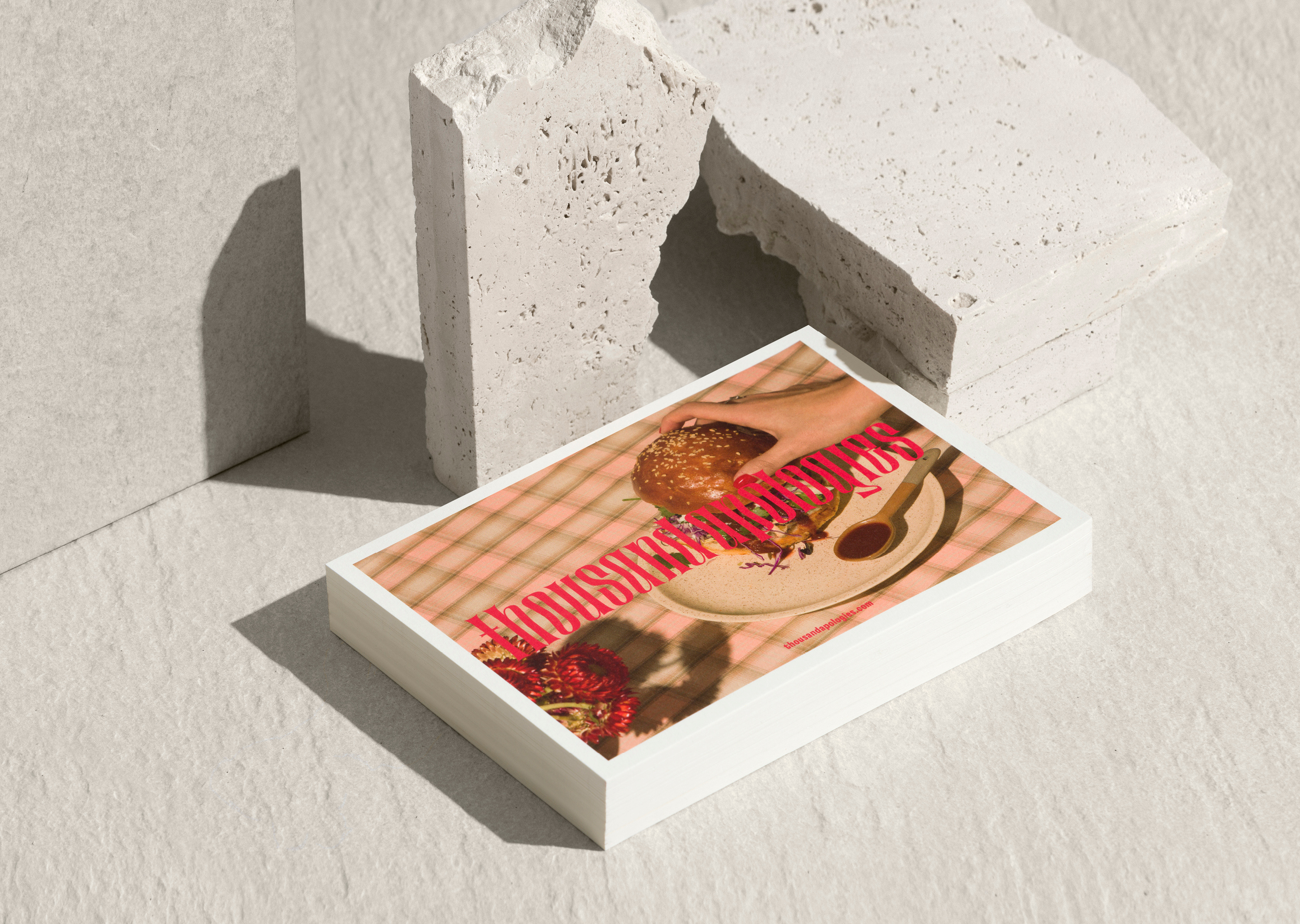
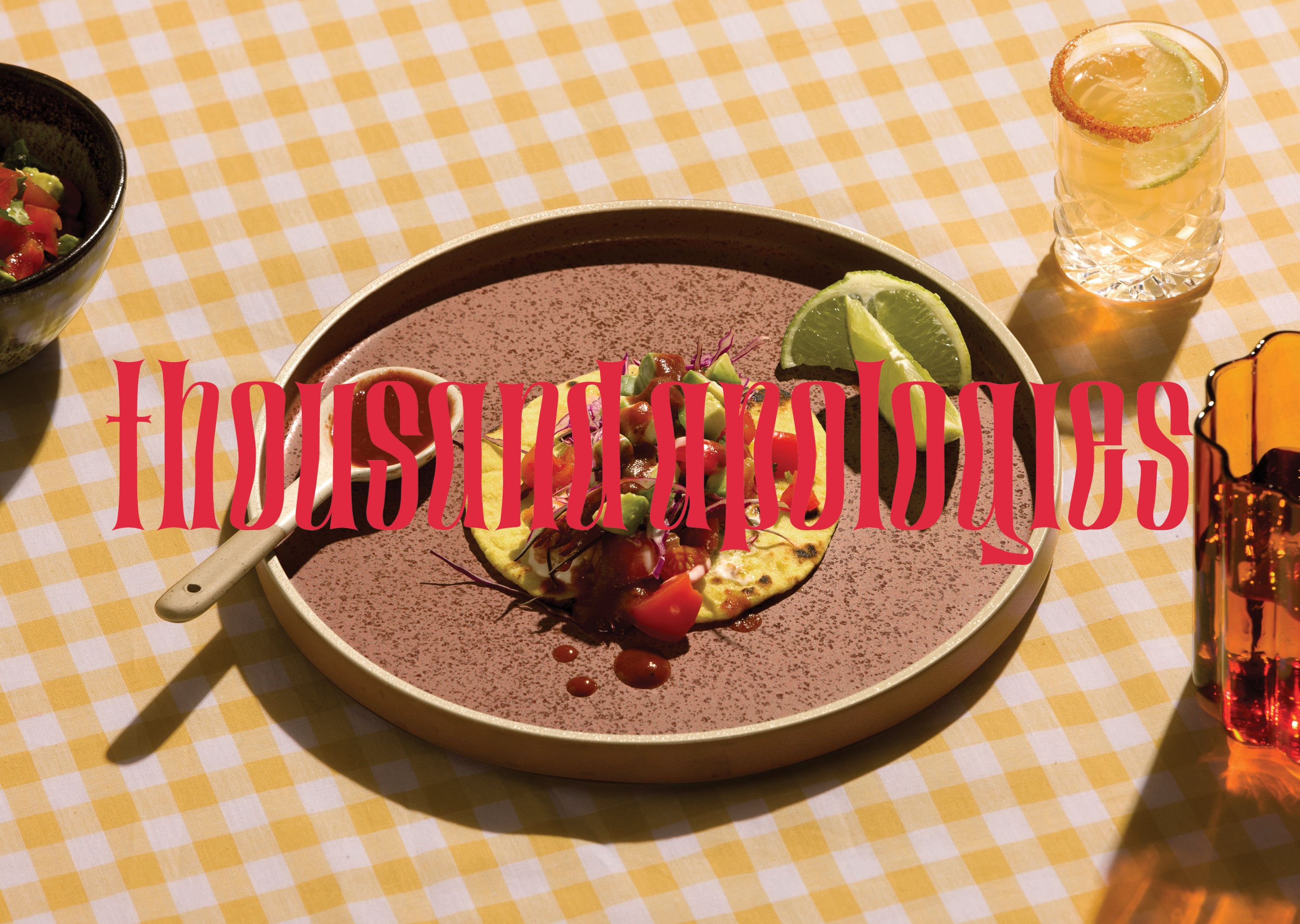
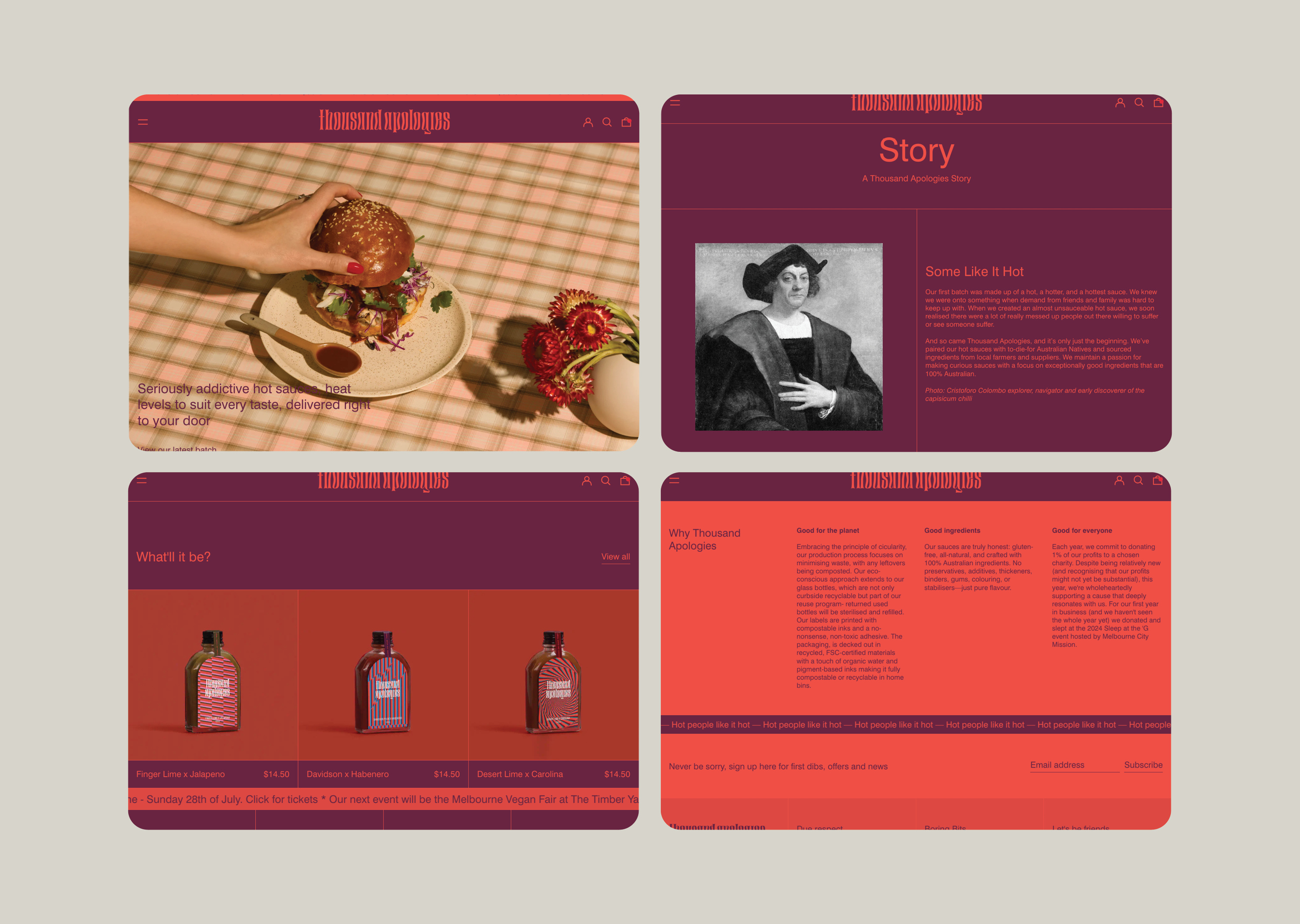
Identity, art direction, gift boxes, packaging, publication, digital design
How we did it
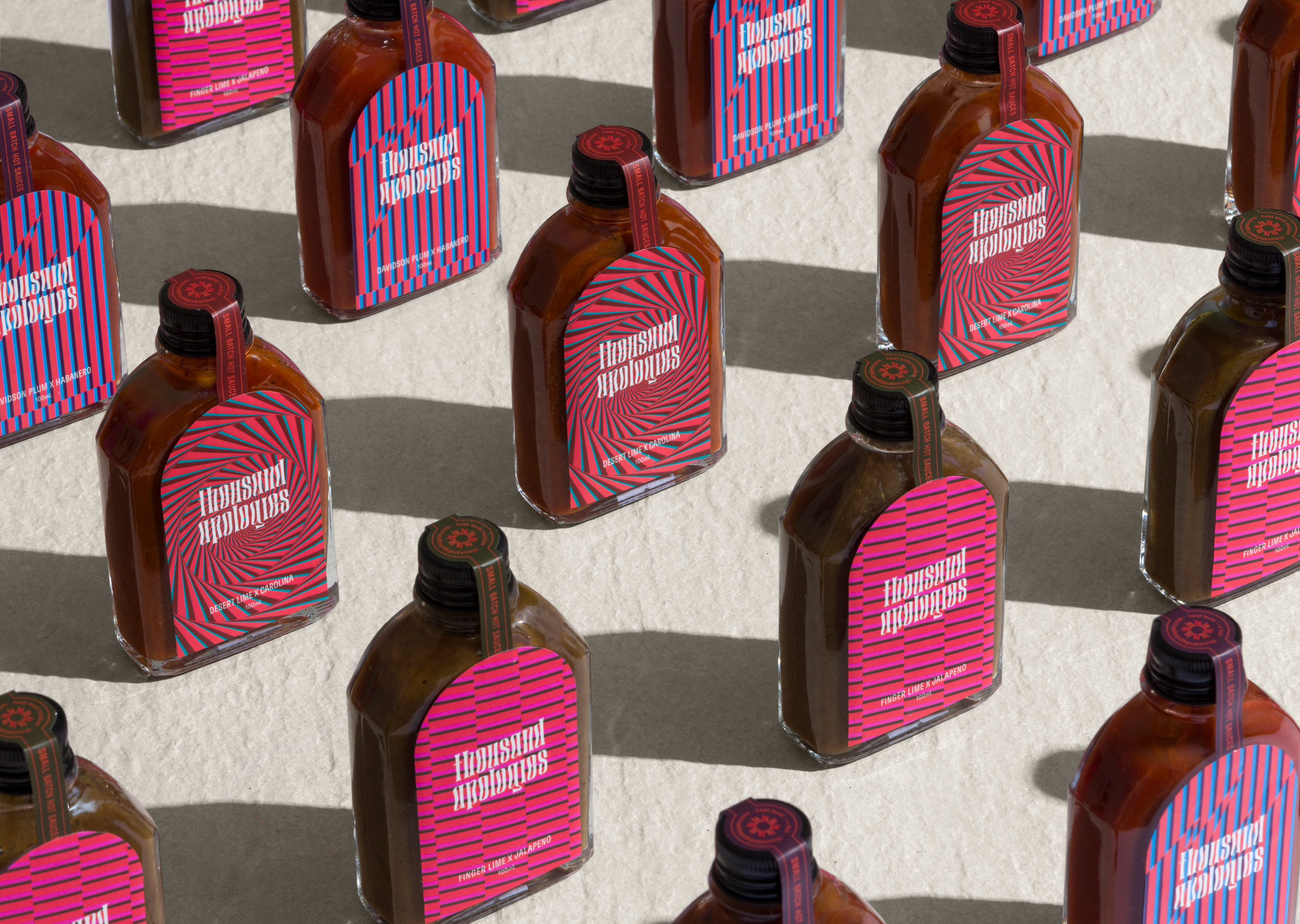
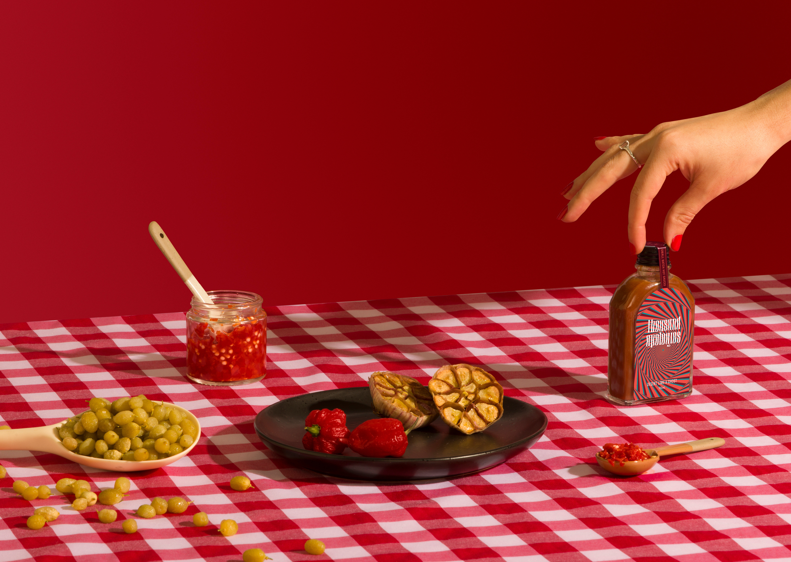
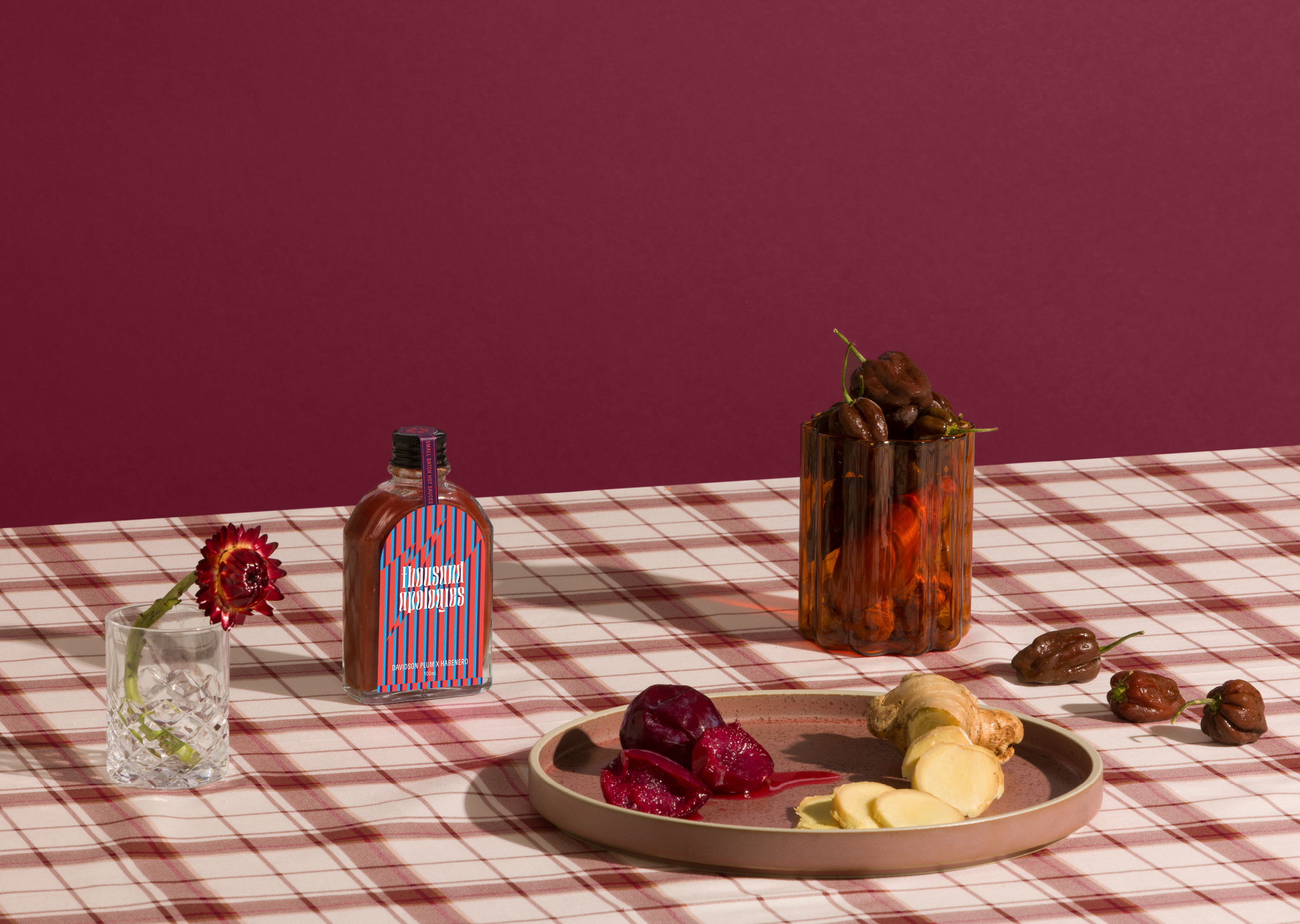
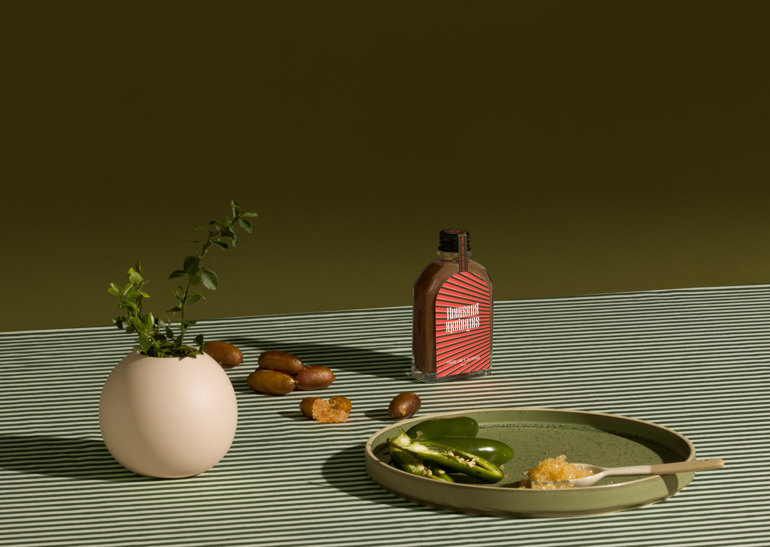
The hip flask shape bottles are pocket friendly, playing on addiction but in a good way – recognising a true hot sauce lover takes their hot sauce everywhere they go. To differentiate the variants the crazier the pattern the hotter the sauce – likened to the chilli high you might get. The logomark also plays on illusion evident of the wiggliness felt when using hot sauce. The art direction is a little bit fancy and a little bit fun, but not in a traditional hot sauce kind of way. The packaging is fully sustainable; The labels are printed with compostable inks and a no-nonsense, non-toxic adhesive. The bottles are part of a reuse program and the packaging is recycled and made with FSC-certified materials with a touch of organic water and pigment-based inks making them compostable or recyclable in home bins.